Nexus Finance
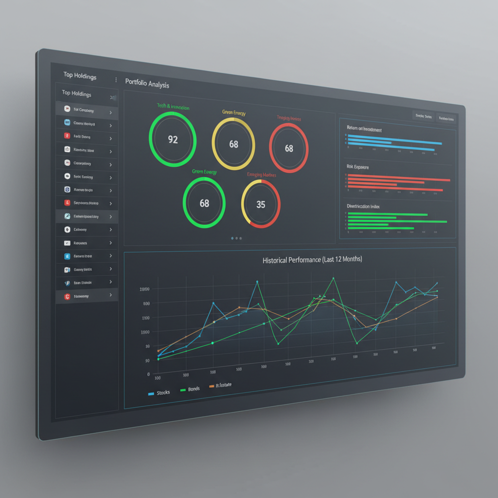
An investment analytics dashboard with real-time market data visualization, portfolio management tools, and a clean, data-dense interface.
Project Overview
An investment analytics dashboard with real-time market data visualization, portfolio management tools, and a clean, data-dense interface. This project represents Webmint's approach to web design — combining thoughtful design with technical precision to deliver a product that meets real business objectives.
What We Were Solving
Financial dashboards need to present large amounts of data clearly without overwhelming users. The challenge was to design an interface that could display real-time market data, portfolio performance, and analytics in a way that was both information-dense and easy to navigate.
How We Approached It
We designed a modular dashboard architecture where users can customize their view. The data visualization uses a consistent visual language — color coding, chart types, and layout patterns — that makes complex financial data readable at a glance.
Key Features
Real-Time Data Visualization
Live market data displayed through interactive charts and performance indicators.
Portfolio Management
Portfolio overview with asset allocation, performance tracking, and historical data.
Price Alerts
Configurable price alerts and notifications for portfolio assets.
Secure Authentication
Multi-factor authentication and session management for financial data security.
Data Export
Export portfolio data and reports in multiple formats for accounting and analysis.
Responsive Interface
Full functionality on desktop and tablet, with a simplified mobile view for key metrics.
Project Gallery
Click any image to view full size
Technology Stack
The technologies used in this project were selected based on the specific requirements — performance, scalability, and maintainability.
Design & UX
The interface uses a dark theme to reduce eye strain during extended use — common in financial applications. Data visualization follows a consistent color system: green for positive, red for negative, blue for neutral. Typography is monospaced for numerical data to improve readability.
Performance Approach
WebSocket connections are managed carefully to avoid unnecessary re-renders. Chart components are memoized and only update when their specific data changes. The initial dashboard load uses server-side rendering for the layout, with client-side data fetching for live values.
What We Delivered
Designed as a portfolio demonstration project
WebSocket integration for live market data
Customizable dashboard layout
Related Projects
 Web Design
Orion Academy
A K-12 learning management system with live classes, assignment management, progress tracking, and a parent communication portal.
 Web Design
Lumina Hotels
A luxury hotel chain website with online booking, virtual property tours, and multi-property management for a premium hospitality brand.
Have a Similar Project?
Let's build a digital experience tailored to your business.